Tanzarine Technology
Web sites Application development Software design Content management HTML CSS User interface design Web servers Java PHP Social media LinkedIn Security Database design Perl Javascript

Tanzarine Technology
Site Redesign for 2013

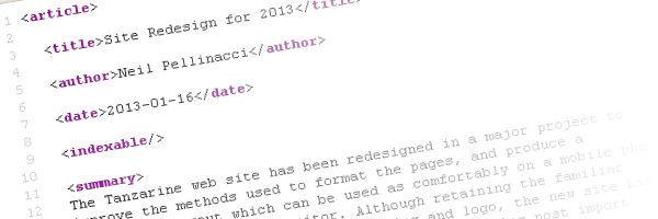
The Tanzarine web site has been redesigned in a major project to improve the methods used to format the pages, and produce a responsive layout which can be used as comfortably on a mobile phone as it can a widescreen monitor. Although retaining the familiar styling based on the company's branding and logo, the new site has revamped and simpler navigation, as well a new blog post import facility.
All of the existing site features, such as automatic index page generation, automatic navigation link generation, and the creation of XML RSS documents containing easily exportable index information, have been retained.
This year's changes have required a new template design and implementation of that template in XSLT, new CSS, and some Javascript extensions, meaning that it is not backwards compatible with the previous layout. However, the use of XML source documents coupled with an XSLT template means that the old layout can be regenerated simply by changing a configuration property and rebuilding.
One requirement for the new design was that it must display correctly on mobile as well as desktop browsers. The previous version would treat a mobile phone like any other browser, leaving the user to zoom and scroll to the text to be read. To achieve this, the site uses the Twitter Bootstrap component library, which includes responsive components which resize automatically as the available dimensions on the display device are reduced.
Further Reading
The following technical articles are a useful starting point for the principles behind responsive design:
Responsive Web Design: What It Is and How To Use It by Kayla Knight
Responsive Web Design: Designing a Website for Mobile Devices by Masahiko Sunami